Girl Culture Films — the brainchild of award-winning filmmaker and photographer Lauren Greenfield — approached SIREN to evolve their brand as the company continues its promise of creating cutting-edge work, while championing underrepresented talent in the modern media landscape.
Founded on the idea of providing opportunities to female directors in the primarily male-dominated space of advertising, the company now seeks broader inclusivity and representation within advertising, film, tv, documentary and commercial production. SIREN felt deeply connected to this mission — helping shepherd the company into a sleek and modernized brand, with a renewed drive and commitment to diversity and inclusivity.

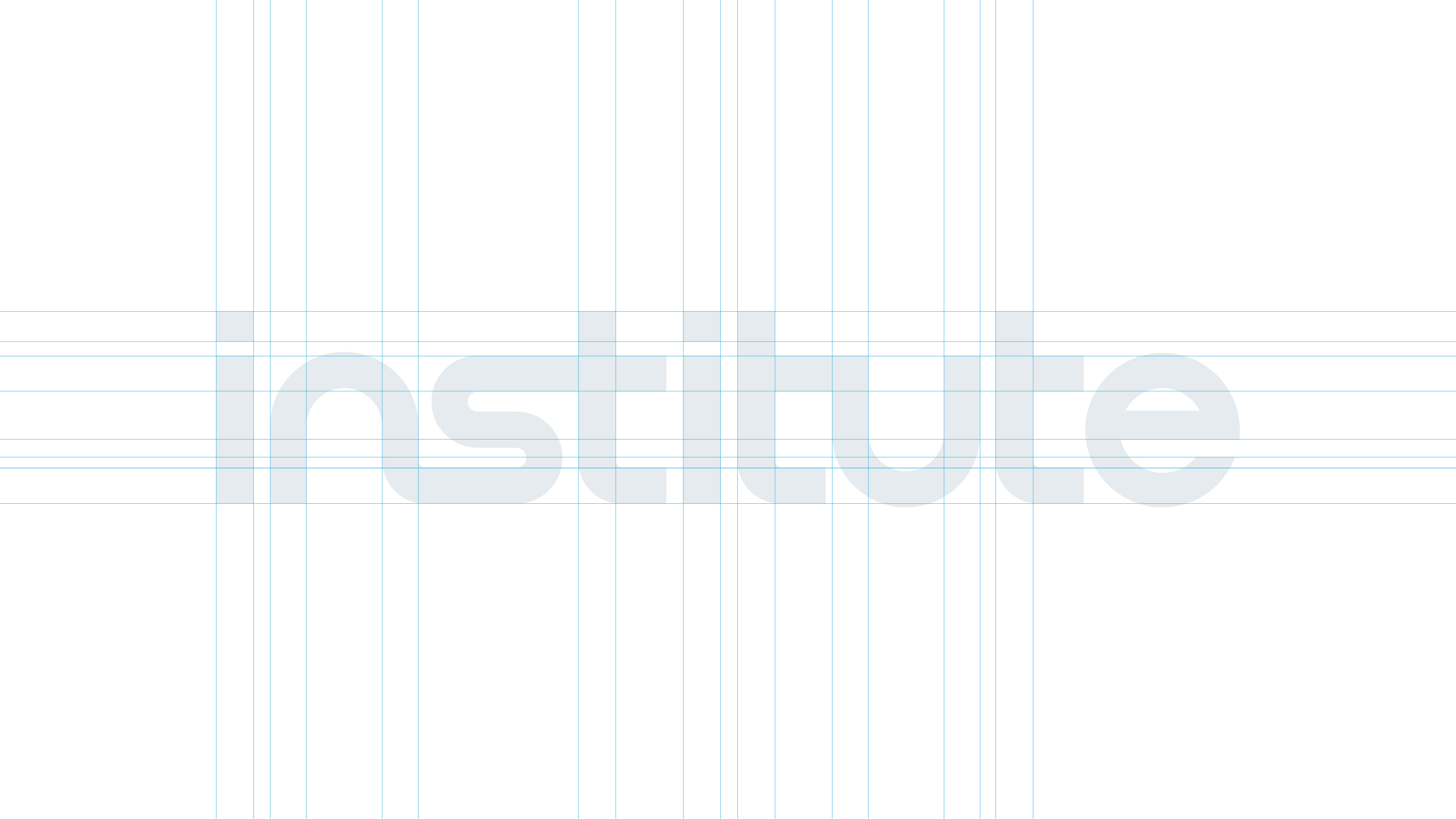
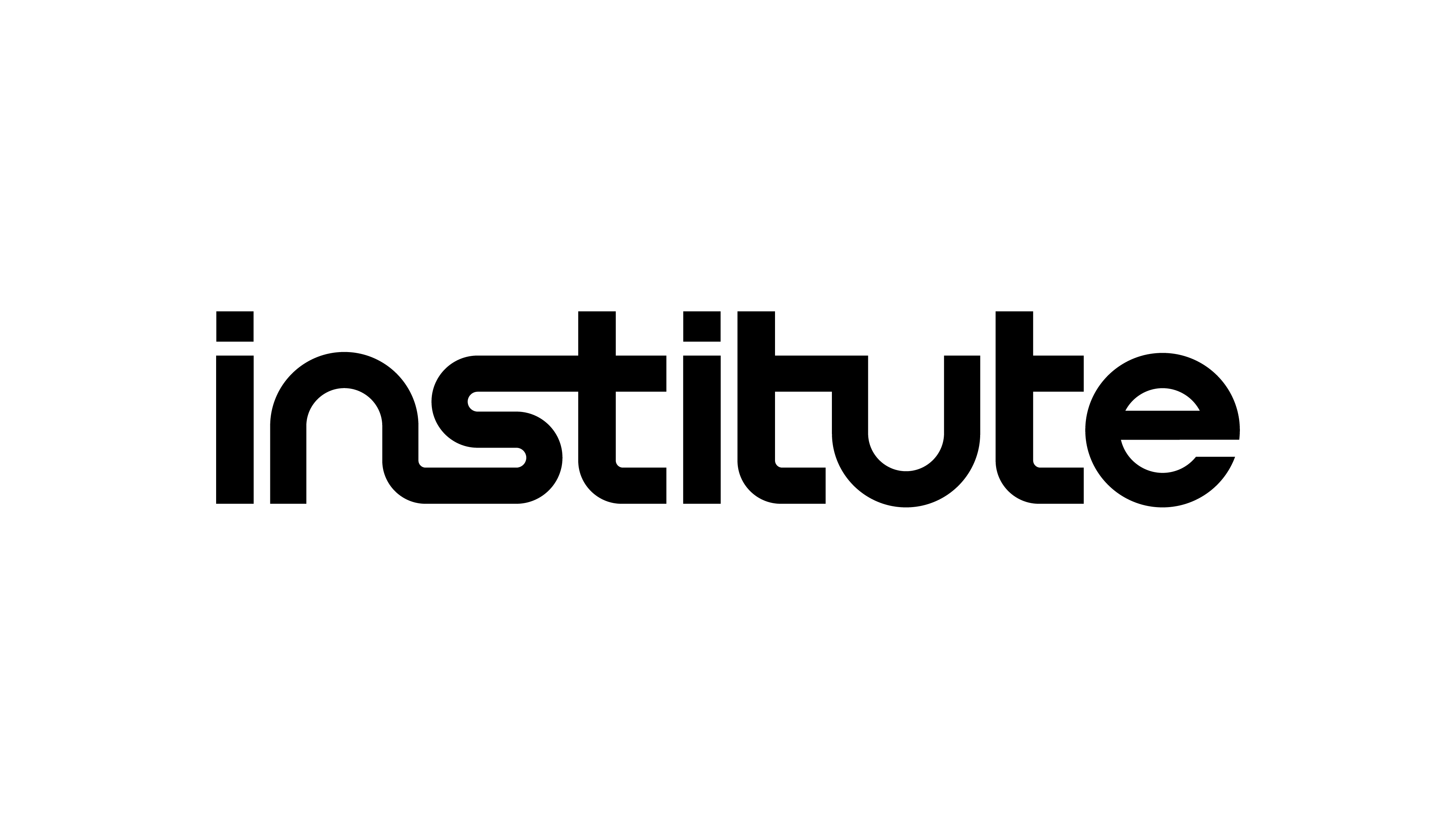
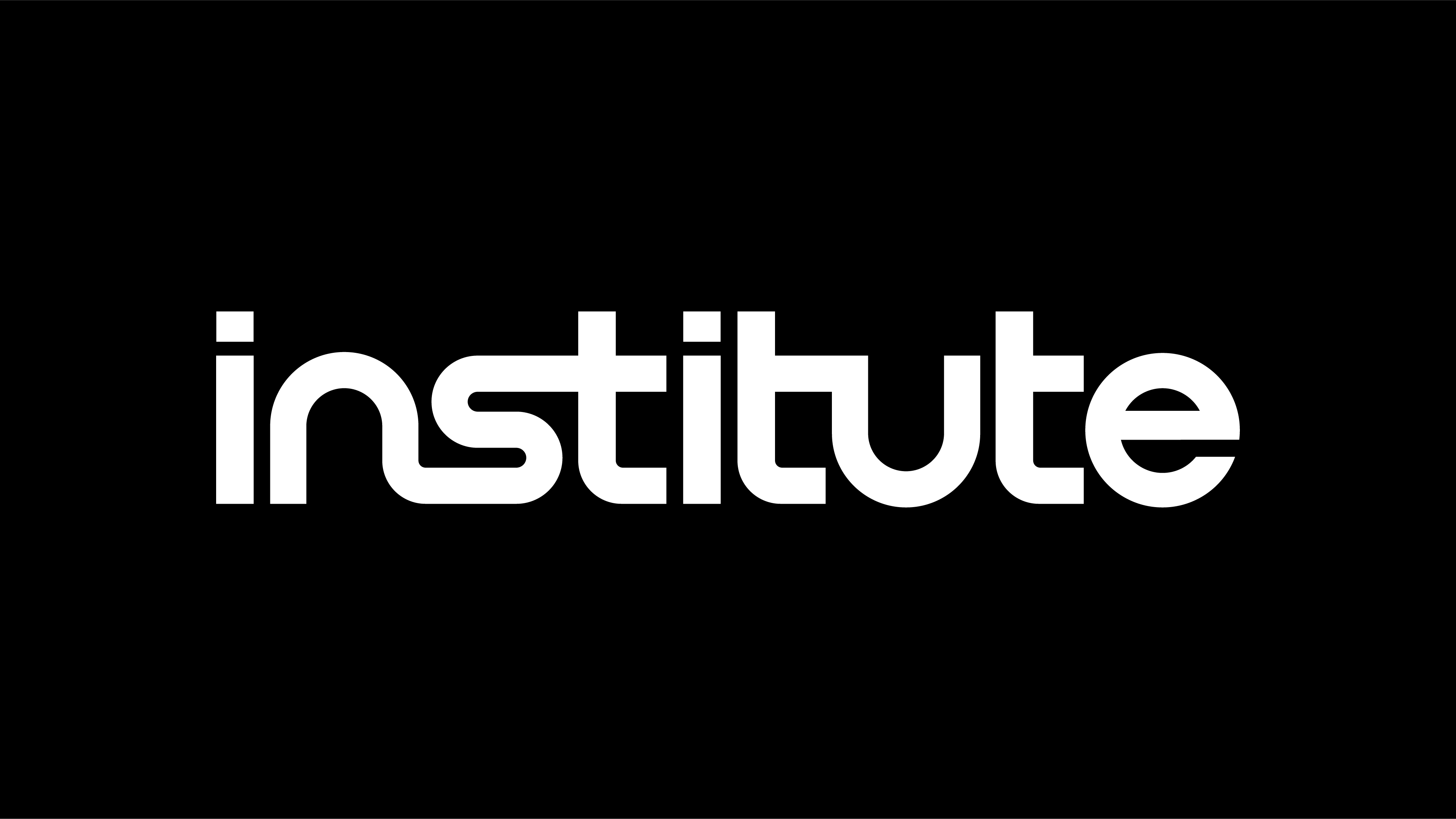
The new logo was drawn to reflect the future-forward nature of the company’s mission. Inspired by Swiss Modernism and the retro-futurism of sci-fi films of the 70’s and 80’s, we crafted a logotype built from perfect geometry. The “n” “s” “t” ligature in the wordmark subtly telegraphs the company’s commitment to connecting talent with opportunities, people with storytelling, and brands with audiences.
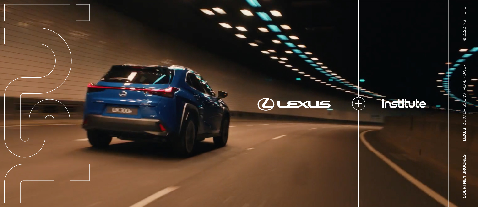
With its inherent structural integrity and its ubiquitous use as a shorthand for “institute”, we pulled the “inst” out as a standalone, secondary mark. The symbol can be used in tandem or on its own to create a bold and impactful impression — driving home the modernist bent of the refreshed brand identity.
The stark black and white palette becomes a framework for positioning the work of their directors front-and-center. Along with the custom-drawn logotype and secondary mark, the brand employs a Swiss Modernist system comprised of exposed grids, thin keylines and the use of Suisse Int’l released by Swiss Typefaces in 2011.
